Superhero Comics' Dark Age: When heroes Became Embodied
In contrast to Lynd Ward’s invocation of the Sublime, superhero comics typically create an opposite effect – they write larger-than-life characters with powers that sometimes bend even time and space to their will. We can perhaps view superhero comics as a response to ideas like the Sublime, especially given that some began as patriotic propaganda intended to push an America-first attitude, like Captain America. To prop up an otherwise mortal human being on an invincible pedestal by giving them other-worldly abilities provides fantasy material to those who either feel powerless in their own life or already believe in human dominion (or national/racial supremacy). For a long time, American superhero comics were individualistic and episodic, each character maintaining a status quo which kept them from ever truly dying, but the advent of the Underground Comix movement in the 60s and 70s might have helped those working in the mainstream to break away from looping traditions. Many comic fans will point to Alan Moore and Dave Gibbon’s Watchmen or Frank Miller’s The Dark Knight Returns as some of the first examples of the Dark Age of superhero comics, though they were not the first to bring more reality into their narratives. A period of industry revitalization and reimagination where thematic concerns became more adult and enduring, comic aficionados slot the beginning of the Dark Age of comics in the mid-1980s. Assistant English Professor Jackson Ayres argues in “When Were Superheroes Grim and Gritty?” that earlier comics already laid the groundwork, citing Frank Miller’s Daredevil as one example of pre-Dark Knight violence and permanent death which shook the status quo of comic worlds. He mentions Daredevil Issue #181, in particular, because it shows the graphic death of major character Elektra (page 23) five years before The Dark Knight Returns. Other pages in Issue #181 explore time, movement, and space in similar ways to the later masterpiece, such as pages 10 and 19 pictured below on the left with pages from The Dark Knight Returns on the right for comparison. In the first couple, Miller takes the traditional panel demarcation and allows his characters to move outside of them, indicating a larger world existing outside of the panel. This calls attention to the very act of framing which, similar to Lynda Barry, imbues a reflective authorial voice into the narrative alongside the regular plot. This is similar to the filmic “frame story” which lends physicality to a literary device. In the second couple, Miller condenses time and enacts horizontal motion by using long rectangular
Comparisons Between Daredevil #181 (1981) and The Dark Knight Returns (1986)
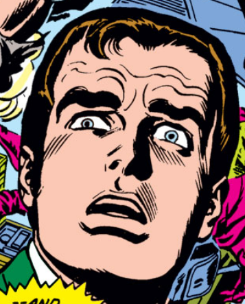
Ayres also mentions one of the titles that I chose for today’s style analysis as an example of lasting human fallibility in comics prior to Watchmen and Dark Knight, the fan-revered two-issue Spider-Man story colloquially known as “The Night Gwen Stacy Died…” permanently. In a video series for the History Channel, writer Gerry Conway talks about how he wanted to find a way to both redeem Gwen’s dull character without recycling old tropes while also allowing Peter Parker a way to realize that he cannot keep blaming himself when his rescue attempts fail. Being a young adult himself, at the time, Conway imbued in Peter much of himself, but I would say that the embodiment of his grief was greater felt by the fans who could not believe that their favorite escapist superhero could lose someone so important to him and, by extension, the readers themselves. The effects of Gwen Stacy’s death in 1973 still reverberate in superhero media today, the most recent of which seen in Spiderman: No Way Home’s climactic fight sequence during which MJ (the MCU’s Mary Jane Watson, played by Zendaya) falls from the Statue of Liberty only for Andrew Garfield’s Peter Parker to swoop in and save her, redeeming himself for Gwen’s death in his original franchise. What is it about the original two issues that caused fans such visceral heartbreak? At first glance, the style of The Amazing Spider-Man looks pretty typical to the superhero genre, though I had difficulty finding scholarly literature reviewing the evolution of comic styles to begin with. PhD candidate Bar Leshem published “Visualizing Superman: Artistic Strategizing in Early Representations of the Archetypal Man in Comic Books” last year, arguing along a similar vein as I that the art in comics has been historically overlooked in art historical and literary analysis. To help correct this, she examines the visual appeal of the original Superman comics and suggests that before the content and plot of the work could intrigue audiences, the art had to draw them in. Other reviews of comic styles through the years focus specifically on page layout, as the comic panel is the most unique artistic tool of the medium. One such survey from 2016, Kaitlin Pederson and Neil Cohn’s “The changing pages of comics: Page layouts across eight decades of American superhero comics,” lays out distinct periods of change to conclude that comics have moved away from traditional grid structures, opting for decorative or “canvas” treatments of the page. Another layout survey from 2019 by John A Bateman, Francisco OD Veloso, and Yan Ling Lau titled “On the track of visual style: a diachronic study of page composition in comics and its functional motivation” posits that the field still lacks an efficient method for mass analysis of page composition, using the same computer-based “corpus analysis” to empirically trace changes over time. Though I see the value in the latter two’s wide-spanning range and ability to see trends across time, their lack of human analysis concerns me. With this research project, I not only aim to understand the current state of the comic studies field of scholarship, but I also intend to contribute as many case-study style analyses as I can, given that comic enthusiasts are more likely to find analyses of comic art on entertainment websites such as BookRiot than their institution’s databases. (I do recommend the linked article, however, as the author’s consultation of the Norman Rockwell Museum lends it more credibility than the average entertainment article.) Like Leshem, I want to honor the technical skill, intellectual pursuits, and embodied experiences of comic artists’ drawing. To begin a style analysis, I must first point to superhero comics’ collaborative ethos which caused their dismissal as a “low-art” for so many years. In general, superhero comics before the Dark Age use bold, smooth lines and bright colors, the end product having a polished and “factory-made,” commercial quality. Any changing line weights seve more utilitarian purposes, as thinner lines made details and texture clearer. Comic artists shaded their characters using blunt shapes filled with hatching or pure black, similar to woodcut techniques. More focus was placed on the action to fulfill their main goals of entertainment and fantasy, of providing an exciting weekly escape to fans of any age. None of this is to say that these drawings lacked artistic skill; on the contrary, working in teams actually helped to heighten every aspect of the production quality so as to ensure consistency, a practice which fine artists from the Renaissance to contemporary times mirror in order to keep up deadlines without sacrificing visual integrity. Comic book groups, especially Marvel and DC, profit from the marketability of individual characters, each one having a “brand” of its own that requires homogeneity in style and appearance to retain its reader base.  Detail of Spider-Man's polished, hatch-shaded body in TASM #121 To begin with “The Night Gwen Stacy Died,” the subject matter is darker from the get-go, creating a slight disjointedness between the perfect, colorful drawing style and Harry Osborn’s depression-led drug habits. As Conway expressed in his History Channel video, much of his writing on Spider-Man took inspiration from his own life as a young person; he would “look around” his immediate world and base Peter Parker and his friend’ experiences on what he knew to be reality, the start to the revisionist ethos of the Dark Age comics. Conway likely knew friends of his own struggling with drug addiction and mental illness, but he also knew that such gritty conflicts would seem foreign to a superhero living in an idealized world, so he channels into Peter’s initial reaction a child-like inability to understand how someone could possibly end up in a situation like Harry’s. Aside from the long-lasting grief he feels from his Aunt and Uncle’s death, Peter does not know how it feels to suffer from a mentally unstable, warped perception of the world and the self, so the typical bold lines and bright colors of the comic put the reader in his naïve, unassuming shoes. Interestingly enough, however, every face in Gil Kane’s drawings looks older than it should, a consequence of too many forehead, jowl, and cheekbone lines. It is as though the more lines added, the “wiser” the young characters become, like baggage added atop their seemingly perfect, always resolved lives.
Details of Harry Osborne and Peter Parker's "old man" faces, both ~20 As for Gwen, Media expert Arnold T. Blumberg writes in “’The Night Gwen Stacy Died’: The End of Innocence and the ‘Last Gasp of the Silver Age’” that Gil Kane and John Romita’s reimagining of Peter’s girlfriend introduced “a note of hope and love into his otherwise dark existence” (198).
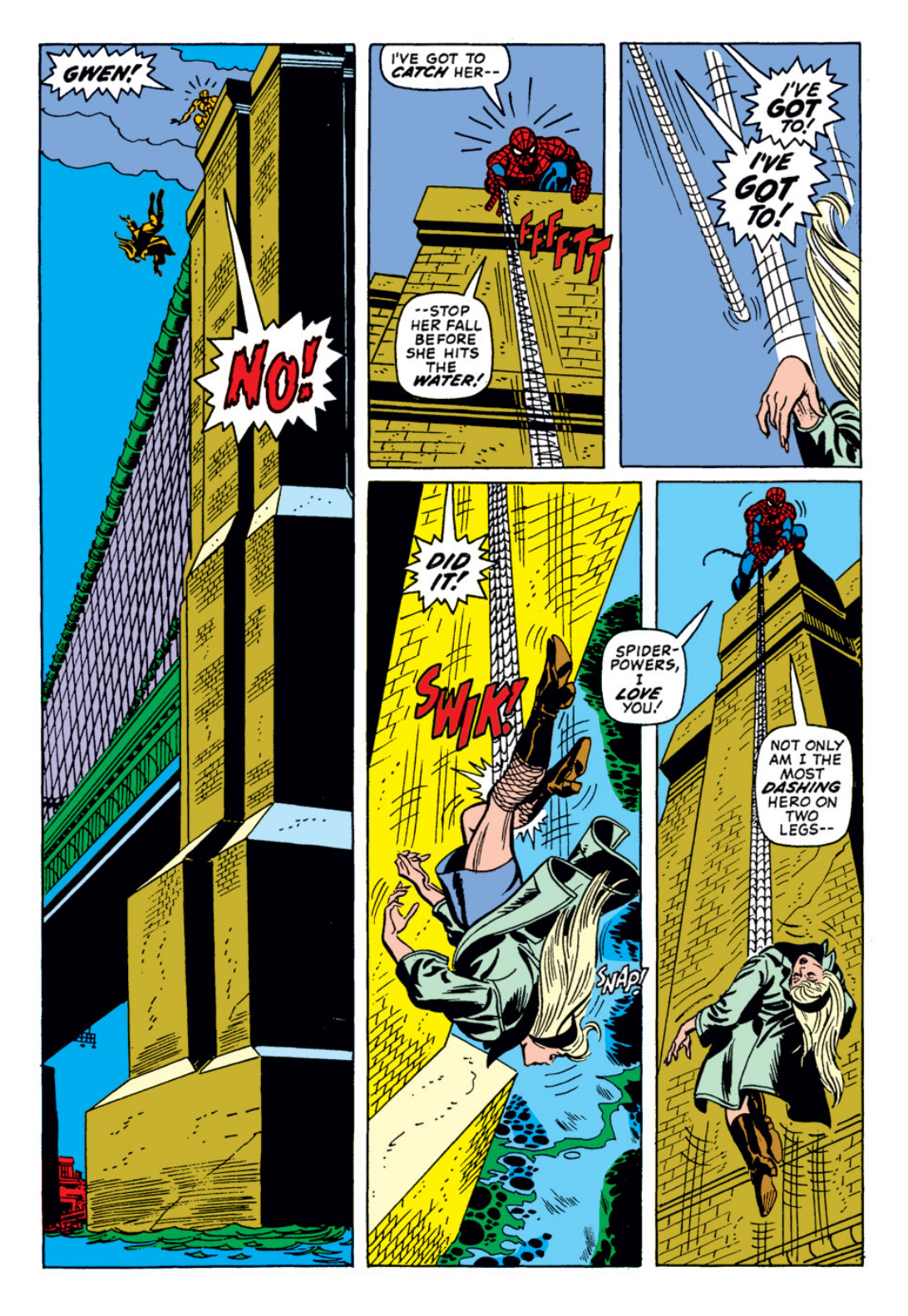
The more painful thing about Peter losing his girlfriend is that his rescue attempt ultimately dealt the final blow, a mistake with a kind of finality never before seen in the series. Throughout the comic, Peter comes down with a fever which visually manifests in little white bubbles punctuated by small lines, a commonly used iconographic symbol for sickliness in comic language. In his already weakened state and growing worry for his friend’s mental wellbeing, he cannot be much help to anyone – not the Daily Bugle office where he works, nor his kidnapped girlfriend at the mercy of a schizophrenic arch enemy. Peter does not realize the stakes, however, and seems to treat this conflict as he would any other – with witty quips and a confident attitude – and it almost seems to work, the heaviness of line contributing to a weighted punch that sends the Green Goblin flying off of the George Washington bridge. The punch panel is given more space than most and uses a dramatic foreshortened perspective, adding to its monumentality. Despite how the punch feels to us readers, Peter remarks that he “couldn’t pack much of a wallop,” the first indicator that his superhuman abilities will not be enough this time around.
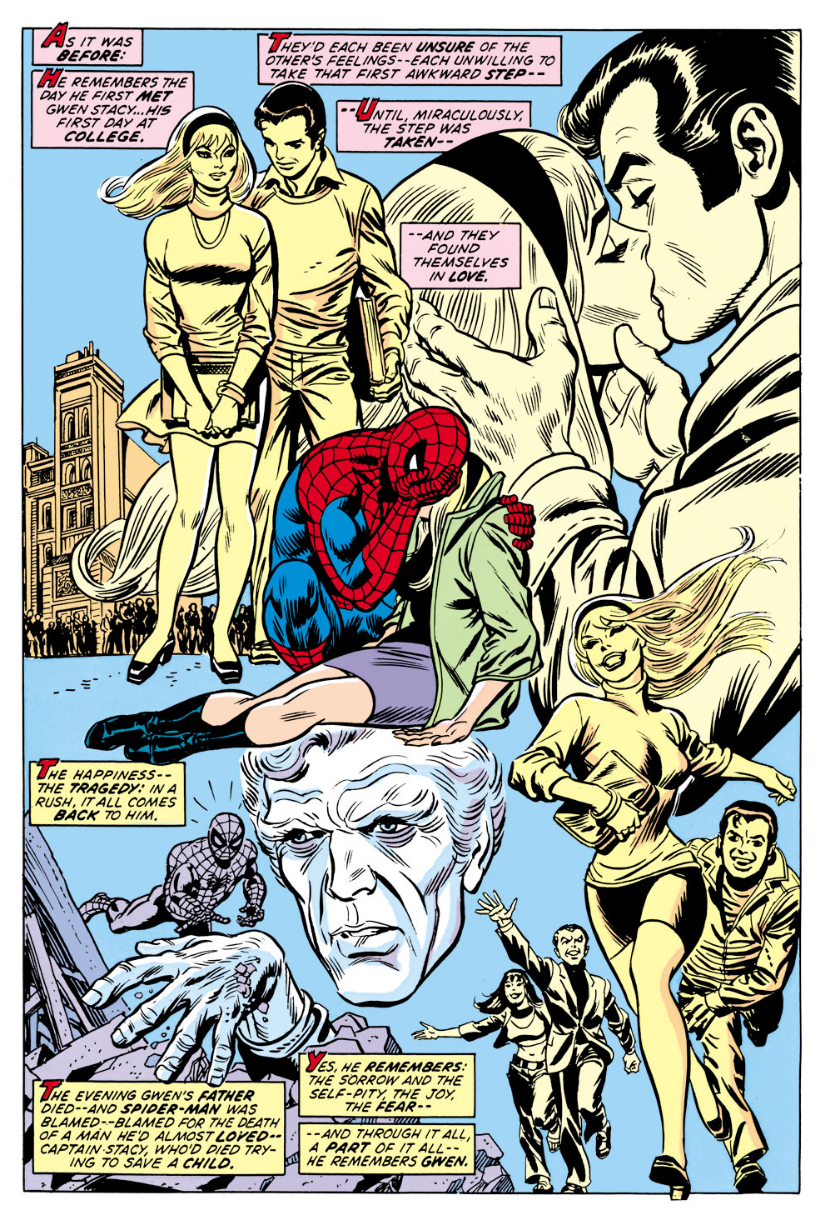
In the next issue, Peter goes a little insane with rage and grief, and the comic artists have to get a little creative with how to represent his hysteria without ever straying from their character’s brand design. Throughout the rest of the fight, Peter’s illness seems to disappear as he swung around and took shots at the Green Goblin. Kane and Romita bring back the sick bubbles, nonetheless, as Peter’s emotions ramp up and he finally has the villain in his grasp. Unlike perfectly-dawn Peter, the artists allow the villain to take on more grotesque expressions, loading his face up with line to sculpt out the dramatic response of horror pictured below. Peter’s mental wellbeing only continues to plummet, the artists graphically enacting this spiral with a falling panel parallel to Gwen’s. The page layouts use this elongated panel often in emotionally charged moments, representing the depth of the fall’s impact on Peter’s emotions and making him look small against an unfriendly, emptier world. One last technique of expression used by Kane, Romita, and Tony Mortellaro (who helped ink issue #122) manifests in the “memory collage,” moments where past experiences come rushing back to a character in a burst of agony. Both Norman Osborn and Peter experience a rush of memory, graphically represented with drawn collections of moments that read like collapsed montages. All three strategies maintain the sleek character design of “factory-made” superhero comics while embodying a striking shift in each character’s worldview.
One of the final defining panels of “The Night Gwen Stacy Died” comes after Norman Osborne has been impaled by his own flying device and Peter realizes he feels no triumph from seeing him perish, left alone in an empty panel with a background the same blue color of Spider-Man: Blue’s cover. Telling the story of how Peter Parker fell in love with Gwen Stacy, Jeph Loeb and Tim Sale’s Spider-Man: Blue – published in 2002 – abandons the previous thick-lined aesthetic in favor of a thinner, scragglier line akin to Frank Miller and Klaus Janson’s work on The Dark Knight Returns, connecting its treatment of the superhero body to a refocused sense of realism and brutal honesty. While exciting typical Spider-Man fans with a healthy amount of action, the heart of the book explores lost young love through frame story narration which tints the whole work with posthumous melancholy.  Panel from Issue #122 The comic opens with Peter Parker returning to the George Washington Bridge – the location of Gwen’s demise – on Valentine’s Day, a two-page spread recreating in full detail the site of Peter’s (and longtime readers’) grief. The bridge drawing looks like a photograph, the image of that event burned into the character, author, artist, and reader’s collective memory. When he leaves a rose in her memory and swings off, a gust of wind blows it off the bridge, causing it to fall in a similar fashion to Gwen. The way Tim Sale draws the stem, jagged and lined, resembles the same webs with which Peter tried to catch Gwen’s plummeting body, the very same which snapped her neck. Gwen, the rose, falls upon the still, somber water in a remorse of its own. Complementary red and green colors draw connections between the vertical reflections and the height from which she fell, the dark petals of the rose and the violence enacted against the poor girl. It is a powerful opening which combines reader memory and atmospheric color to tell an empathetic story which prioritizes emotion over action.
Honestly, I am running out of things to say which do not repeat ideas I have already addressed, but I may return to this blogpost upon further reflection. Almost all scholarly interest in comics lays in their cultural impact, so I am of the opinion that any formal analysis I can offer to the field benefits its growth and overlap with art history. Further Reading: Though not the focus of my visual interest and beyond my knowledge set with regard to superhero comics, Aaron Taylor's “'He's Gotta Be Strong, and He's Gotta Be Fast, and He's Gotta Be Larger Than Life': Investigating the Engendered Superhero Body" provides an excellent analysis of cultural body theory and the superhero body as both sexed and subversively androgynous.
0 Comments
|