Expressionist Woodcuts and the Beginning of Comix History
After finishing my marathon of Lynda Barry’s work, I want to take a step back and look at the origins of comics – the points at which other mediums evolved into what we now call the graphic novel and their roots in human development, culture formation, and social change. Though I ultimately decided not to write on Barry’s What It Is because of how much it crosses over into collage (to which I may return), she makes an argument for images as bodily experiences that matches my characterization of mark-making as a visceral human act. To look at comics through the lens of mark-making, however, focuses on that which is expressive rather than highly polished, as I tend to see the latter as a distillation of raw emotion instead of a reliving of that emotion, mediated by drawing. Both spontaneous and meticulous drawing share expressive elements, but it is the former which we typically call “Expressionism.” In my view, graphic novels are all essentially “expressionistic” because, as the first word in that term entails, they simplify their depictions to the bare essentials needed to express a specific feeling. How many lines does it take to graphically represent joy? Is that fewer lines than it takes to represent depression? Fewer than Fear? Anger? How does it compare to a close cousin, such as euphoria? Unless working in hyper realism, the artist selects a limited number of lines in graphic representations, establishing a hierarchy. Forms which the artist deems essential to the emotion they wish to portray sit higher in that hierarchy than those they exclude, though every artist uses a different set of hierarchical forms which results in their “style.” Since individuals experience their emotions differently, they must each have a unique relationship to the various parts of the body affected by such emotions. This must contribute to their decision on which forms on the body they depict; an artist’s mark-making, I theorize, reflects their individual sense of physicality.
We could trace the modern graphic novel back to the very first instances of human mark-making in caves and rock formations. In “Mark Making and Human Becoming,” researcher Lambros Malafouris posits an archaeological theory on the implications of cognition in early humans’ mark making, the very first step towards the famed German Expressionist movement which inspires so much graphic art. He refers to a material, enactive signification which entails the “semiotic co-emergence of the signifier and the signified [as theorized by de Saussure] that brings forth meaningful affective experiences and novel conceptualizations about the world” (96). To bring about these conceptualizations, Malafouris writes that humans have a tendency for creativity and for the usage of any material as a creative tool, as the “plasticity” (96) of the mind parallels that of material culture. In asking “how do marks mean,” he looks to their material but also their intention, noting that early humans did not laden every mark with significance. Malafouris uses the term “thinging” (98) to refer to the way that external tools and materials become a part of the mind and body when humans use them as vehicles to think and feel through rather than simply about, what comix artists might do with their art tools. I think this characterizes Lynda Barry’s different ways of working with ink nibs and brushes – the childhood embodiment she performs with the former and the reflective conclusions she arrives at with the latter. This is what Malafouris means by “material signification:” the encountering or unearthing of experiences through the use of a material rather than using it to symbolically represent. I wonder how many comix artists view their work as embodying in this way, or if they feel more removed from their artistic practice. I would think artists such as Art Spiegelman and R. Crumb, both men who pay special attention to the way they depict the human form, would view the comic as an outlet for bodily experiences. Spiegelman said in an interview with NPR that he thinks of comics as a direct, visceral, and abstract medium, all characteristics exemplified in his magnum opus Maus which tells the story of his father’s Holocaust survival and the myriad of ways in which his parents’ trauma bled into his own life. R. Crumb, in a very different thematic vein, describes in an interview with The Guardian his youthful sex-craze which inspired much of his work in the underground comix world drawing voluptuous women. Both men cite comix as the method by which they unpacked, dealt with, and moved past their mental afflictions, lending credence to my theories on comic-making as a bodily art.  Page from Art Spiegelman's Maus II  The Guardian: Spread from R Crumb, Sketchbook, 1971. Photograph: Kerry McFate/Courtesy the artist, Paul Morris and David Zwirner Malafouris uses ochre as an exemplary material which early South Africans in the Blombos Cave used for both additive and reductive mark-making, the specific stone he references pictured below. The siltstone piece features two rows of cross-hatching lines, a visual technique used by virtually every artist working in ink. While most archaeologists hypothesize that the lines must have symbolic meaning to the inhabitants of Blombos Cave – “representational abstractions,” (102), at the very least – Malafouris suggests that the Blombos community might have created the marks for the sake of mark-making, for the physical action involved in cutting into stone with another object. He writes that “the mark-making process is not a symptom or index [referring to Peircean semiotics] of achieving humanity (becoming human) but an actual part of the ongoing process of human becoming” (101), meaning they might have played a part in the evolution and expression of mental experiences. He does not deny the potential meaning in the Blombos people’s marks, but he also insists upon an experiential understanding of the mark-making which, I think, is evident in the directionality of the carving. Whatever the reason for the specific pattern inscribed, its creator methodically scored the flat surface of the stone in one direction before crossing back over with perpendicular lines. They then went over the cross-hatching with horizontal lines as though to connect all the middle points and frame the top and bottom of the pattern. It reminds me of doodles in a notebook that casually play with pattern, working out ideas to combat the wandering mind of boredom. The design could have meant many things, but it also might have been a mere compulsion by some ancient person to unite motor function with ideas bouncing around in their head. Both additive and reductive mark-making have bodily consequences depending on their usage.  Description from Henshilwood article (referenced by Malafouris): "This relatively large rectangular piece (166.6 g) is a moderately cemented siltstone that is reddish-brown in colour. One end is modified by continuous retouch and on one long edge there is a large removal and a thin ground facet. The opposite long edge was flattened by grinding and scraping before a cross-hatched pattern was incised (Henshilwood et al., 2002, Henshilwood and d'Errico, 2005). Both the top and bottom of the piece show evidence of grinding and scraping over an extensive area."  Order of the engravings on the above piece. (Description from Henshilwood article: Each new set is highlighted in dark grey. Arrows indicate the direction of the engraving tool.) Both figures taken directly from an article by archaeologist Christopher S. Henshilwood. These bodily consequences reverberated throughout history in illustration and printmaking, especially in the reductive process of woodcuts which have been used in comic-making. Returning to Art Spiegelman, he references in Maus a woodcut comic he did in the 70s titled The Prisoner on the Hell Planet, which brings us full circle back to the wordless novel and its relation to embodiment. Spiegelman’s comic is not wordless, but its sharp-edged stylings of the haunted faces of trauma take direct influence from the very same wordless novels which I will analyze today. Belgian artist Frans Masereel pioneered the medium, creating a number of wordless novels in the style of the German Expressionist movement, the first being 25 images de la passion d’un homme or 25 Images on the Passion of Man which most hail as the first of its kind. Lynd Ward, author of Gods' Man and Vertigo, brought the expressionist woodcut style of Masereel to the United States where the medium spread in popularity until the rise of sound film rendered it (and silent film, an arguably related artform) obsolete. Cinephiles might recognize The Cabinet of Dr. Caligari (1920) and its striking architectural forms meant to depict the warped mental landscape of the film’s narrator. Though the film has become one of the most recognizable symbols of the Expressionist movement, MoMA Curator Starr Figura writes in German Expressionism: The Graphic Impulse that the Expressionists most favored printmaking to represent the sociopolitical underpinnings of their visual revolution. They stood in direct contrast to the “academic refinement and placidity” (10) of the bourgeois, moving towards more graphic styles whose expressive abilities were more immediate, genuine, violent, and messy. Figura writes that Expressionist styles were characterized by “simplified or distorted forms and exaggerated color” (10), so it is no wonder that woodcut’s rough aesthetic and process appealed to them. Not only did they value the medium for its experimental appeal, but they also used its reproductive powers to promote and widen accessibility to their ideas, the very pathos of underground comix and print media at large.
In a video by the Toledo Museum of Art titled “The History of the Woodcut and Printmaking’s Collaborative Process,” Master Printer Phil Sanders describes the shift in the woodcut’s usage from communicative to artistic, beginning with their inception in 600s China. As a medium of mass duplication, print media disseminates information to more people than was ever possible before. As I learned in my Visual Studies course with Professor Bloom, anyone below nobility status in the Medieval era might have seen a total of twenty or thirty images in their lifetime, and those they did see were likely religious depictions or propaganda. Print media maintained both of these uses in later centuries, but I can only imagine how much power such images would have had in feudal times when they were the only ones to which common folk would ever have access. As Sanders explains, printmaking allows the artist to “extend their influence beyond their own lives,” but I think the increased accessibility of print media also allowed regular people to extend their knowledge beyond their own lives. With the arrival of paper (more affordable and easier to work with than parchment) and Johannes Gutenberg’s movable type, writers and artists began to publish manuscripts with drawn images to compliment the text. After this point, the artist Albrecht Dürer transferred his drawing and engraving skills to “reinterpret the medium” of woodcutting. Before the introduction of oil-based ink, woodcuts were printed in flat “black line,” but Dürer was able to use this new tool to set “white line” atop a black field and deepen the sense of space to create real perspective in the woodcut medium. Moreover, because of the reproducibility of woodcut prints, many people encountered these images and learned from Dürer’s innovative white line technique. Sanders believes that Dürer valued the role of the observer in his work, “inviting them into his world” by so heavily enriching the woodcut with his fascination for the built and natural landscapes. All this shifted the common view of image-making via printmaking from a functional object to an artistic one. While Dürer’s focus lay in depth and perspective, I think his desire to draw the viewer into his woodcuts as well as his penchant for drama carries into the way that the Expressionists would later employ the medium in their own aesthetic reinvention.  Frans Masereel's Entry in the Oxford Dictionary of Modern and Contemporary Art In one example, Frans Masereel’s 25 Images de la Passion d’un Homme tells the simple story of a working-class man living amongst violence and authoritarian rule revolting against his employer in the spirit of Masereel’s socialist upbringing, told in 25 woodcut prints. The quality of the line he gets in woodcut print is quite angular, many of the prints relying more on negative space and Dürer’s white line method to carve out shapes of light in an overwhelmingly bleak world. Take the second panel, as pictured at the top of this blogpost, in which a pregnant woman is about to give birth. Masereel cut away a blindingly white halo around the mother figure which recalls images of the Christian Virgin Mother pregnant with the baby Jesus, though the woman’s expression carries the heavy weight of fear and exhaustion with thick, black lines in and around her eyes. The light covers the front of the woman’s dress, framing her pregnant belly in white with a jagged, cutting edge. We see in the following panels that this society demonizes children born out of wedlock, the woman’s family banishing her from their home. A crisp white carving once again highlights the woman’s body as she breastfeeds her child outside. This light implies the “blessed” nature of the baby as both a beloved child to the mother and a later revolutionary leader, but to create such a highlight, Masereel must literally carve into her body, enacting the violence already cast against her and muddling the symbolic morality of the color white. Other prints are more detailed, such as the one depicting children at play beside a river. Though the forms seem simple, Masareel unearths every white mark from the darkness of the flat wood’s impression, carving out a city from obscurity. Thematically, it characterizes and aestheticizes the city as dreary and austere, though Masereel’s unsteady white line almost creates a stagnant jitteriness, a premonition of the coming rebellion. In spite of their daily slog, the buildings in the background stand starkly against the darkness, carving their own place in the black field. The panel in which police harass the man, however, performs an opposite function; for Masereel to let so much of the black field take over the panel links the city’s law enforcement with its authoritarian gloom, best represented in the way the officer towers over – almost enveloping – the young man. In the following panel, the man finds himself in a completely darkened prison, the few white lines which outline his cell jagged and messy. The light halo around his head reads as both sparks of motivation and the bubbling over of anger, the black box otherwise trapping him in hopelessness. A few panels later, the newly released man looks for work, literally trying to carve himself – via pickaxe and the jagged white lines of his pants outline – a new place in society. The reader can see every violent mark Masereel gouged out of the wood, a stylistic element which adds to the growing fervor for sociopolitical change felt in the comic and in his daily life. The comic leads up to its climactic worker’s rebellion and the busiest (line-wise) panel of the whole work – number 6 in the slide show. Like the cobbled streets beneath them, the forms which make up each human in that print appear mosaic-like, white lines crowding the image in a desperate attempt to overcome the darkness which treated them unfairly for so long. The composition implies impending victory for the workers, their crowd pushing the officers to the edge of the frame, every arm angularly outstretched. It is all for naught, however, and the young man is brought to trial before an illuminated crucifix before he, too, faces death in a parallel halo of light. Throughout the comic, the birth, resistance, and death of this young man parallels the Christ figure and his historical depictions with a halo, implying that even in death he will serve as the Messiah for salvation that will come someday in the indeterminate future.
carve out the dramatic cresting of the wave with Nückel’s thinner, cross-hatched lines to give more delicately shifting tone to the sail and stormy skies. With Nückel’s composition and use of tone imitating painterly styles on one side and Masereel’s thick lines and blunt forms staying firmly graphic on the other, Lynd Ward sits right in the middle of the stylistic continuum.
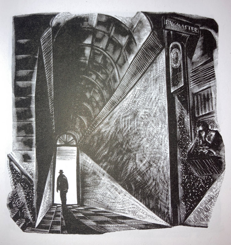
Two things strike me when trying to deduce Ward’s potential bodily relationship to the line: the bold, energetic quality of graphic lines, and the invitation into three-dimensional space of perspective and tone. Frans Masereel’s stories agonize on social reform and, therefore, share graphic design elements with protest and propaganda material. There is nothing wrong with this style – in fact, its use helps readers understand it as an act of protest in itself – but its unchanging line weight can lack nuance and burdens readers with an onslaught of despair and anger. Its images want to make their meaning very clear. Ward, on the other hand, is an artist making a woodcut novel about an artist, and though it also has a lot to say about abuses of labor, it consistently maintains a high level of technical prowess to do so. He divides his use of graphic lines and painterly shading between human and landscape, respectively. Where Ward’s clear passion for the natural world and built environment manifests in gentle contours that build up tone based on the distance between each thin stroke, he models human figures – especially faces – with jagged marks. The figures themselves are caricaturized, the thinnest faces almost looking malnourished with how darkly and sharply Ward cuts them. The panel below shows off the dichotomy between figure and environment well; the artist, eyes darkly downturned by the shading beneath his brow bone and shirt choppily sliced into sectioned folds, stands in direct contrast to the gentle gradient of the light behind him. The drawing he attempts to offer as payment to the innkeeper uses similarly soft, thin lines to contour the sun, the object of his affections. Ward’s treatment of the environment seems loving and angelic in contrast to his harsh treatment of human beings, as though he finds their nature innately ugly and abused. That he makes them out to look more graphic also suggests that he acknowledges his hyperbole, that humans are not individually like this, but in a collective, they represent patterns of sinister behavior. This nuance in line treatment is not possible without combining techniques.  Print 14 from Gods' Man As an extension to Ward’s characterization of human greed, he ridicules the pointlessness of worldly financial endeavors by using elements of the Sublime. In the section titled “The Brand,” the artist has made a name for himself, and others seek out his work alongside his persona. This includes a beautiful, sleekly carved woman who catches his eye at a gallery opening, her fair skin, thick black eyes, and sharply contoured cleavage standing out amongst a crowd of greedy, creepy men. After she becomes his muse, he asks about a money sign branded on her shoulder to which she replies with a wide, stiff smile over her shoulder. Ward seems to imply either that her interest in the artist was only born out of greed with his sudden success or that she, too, has sold herself into capitalism, her unique beauty amongst a crowd of money-hungry men tarnished by this revelation. Either way, the titular brand refers to both the physical brand on the woman’s body and the invisible brand which the artist’s dealer created for him that has corrupted the original pure intentions of his artwork. The artist falls into a depression, wandering the city streets with his head hung low and body depicted in full black shadow as the buildings seem to get larger around him. The growing size of the environment around the artist expresses his growing dread and the weight of his fame tumbling back upon him, but it also places his societal troubles into perspective and makes him appear small in the grander scale of the world. The artist also visits a Gothic church in this sequence (specified by the portal typology in the last panel below), a significant reference because Gothic churches value scale and height in order to bring the heavens closer to Earth whilst also keeping them out of reach in the rafters of the cathedral. The scale and divinity of the natural world – the heavens and God’s realm – trivialize the artist’s existence and financial success while also validating his artistic fascination with it. Being one of his most successful works, I have to wonder if the feeling of cosmic insignificance despite worldly accomplishment relates Ward’s own experiences. If so, what does it mean for him to continue making such fine quality woodcuts despite the massive inconsequence of his career? I think he answers this question in the final two acts of the novel: “The Wife” and “The Portrait.” In the former, after escaping the city and his tormentors, the artist meets a lovely, earthly woman who helps him regain his sense of wonder in the natural landscape’s natural beauty. More of these prints feature hints of the Sublime in their composition, but they also use fewer blocks of darkness so as to lessen the dread in their monumentality. The notable exception to this characterization is a scene in which the woman brings the artist up a mountain to stargaze; Ward uses Dürer’s white line to carve in a night sky atop a black field, but its quiet beauty renders the monumentality of the sky beautiful and romantic rather than overwhelmingly terrifying. After this moment, it seems that the artist’s worldview changes, and the woodcuts feature some of the most delicate carving work in the whole novel. Patches of thin lines crossover one another in varying patterns to create shifting tones in the cloudy sky, gently sloping peaks grazed by dainty streaks as rays of sunlight cut down from above. After the birth of his child, the artist raises his arms in praise of the sun which inspired the artwork that started his career in the first place. He expresses love despite everything.
This carefully carved visual language carries into “The Portrait” even as the sky gets darker the closer to death the artist gets, representing a resounding belief in the necessity for art making despite the meaninglessness of life. A dark figure approaches the artist’s home, the same person who first saw the artist’s art as valuable, and invites him back up the mountain to paint his portrait. In appreciation for the figure’s earlier kindness, the artist agrees, and as they venture up the slopes, string-like line work moves closer and closer together to simulate a storm brewing at the mountain’s peak. The blackness of the cloud’s center matches the dark figure’s silhouette as the artist sets up his easel, but when the figure finally removes his mask, the artist is struck with fright and falls to his death from the cliffs. The final print reveals the figure to be Death, symbolizing the artist’s ultimate realization that his beloved natural world will inevitably kill him, that in making art about nature he must recognize its overwhelming powers against him. Even in death, however, the artist’s body is framed by a single beam of light streaming down from the heavens which mirrors the very sun he praised just pages before, and when he dies, his body falls back into the Earth. If Ward sees himself in this artist, he sees himself as surrendered to a higher power which is not a God singular but Gods plural, a system of powers that make up the natural world which impresses and overshadows him. He feels that the return of his body to the earth is inevitable, but also that the earth is so wildly impressive, it deserves his full artistic attention while he is alive. To make any meaning at all from an otherwise meaningless existence requires the use of his ability’s full extent: masterfully crafted woodcut novels like Gods’ Man.
0 Comments
Your comment will be posted after it is approved.
Leave a Reply. |